SELECT WORK
Every brand has a voice. Let’s make yours sing.
From scrappy startups to purpose-driven ventures, I craft visual identities across myriad industries that speak up, stand out, and stay true.
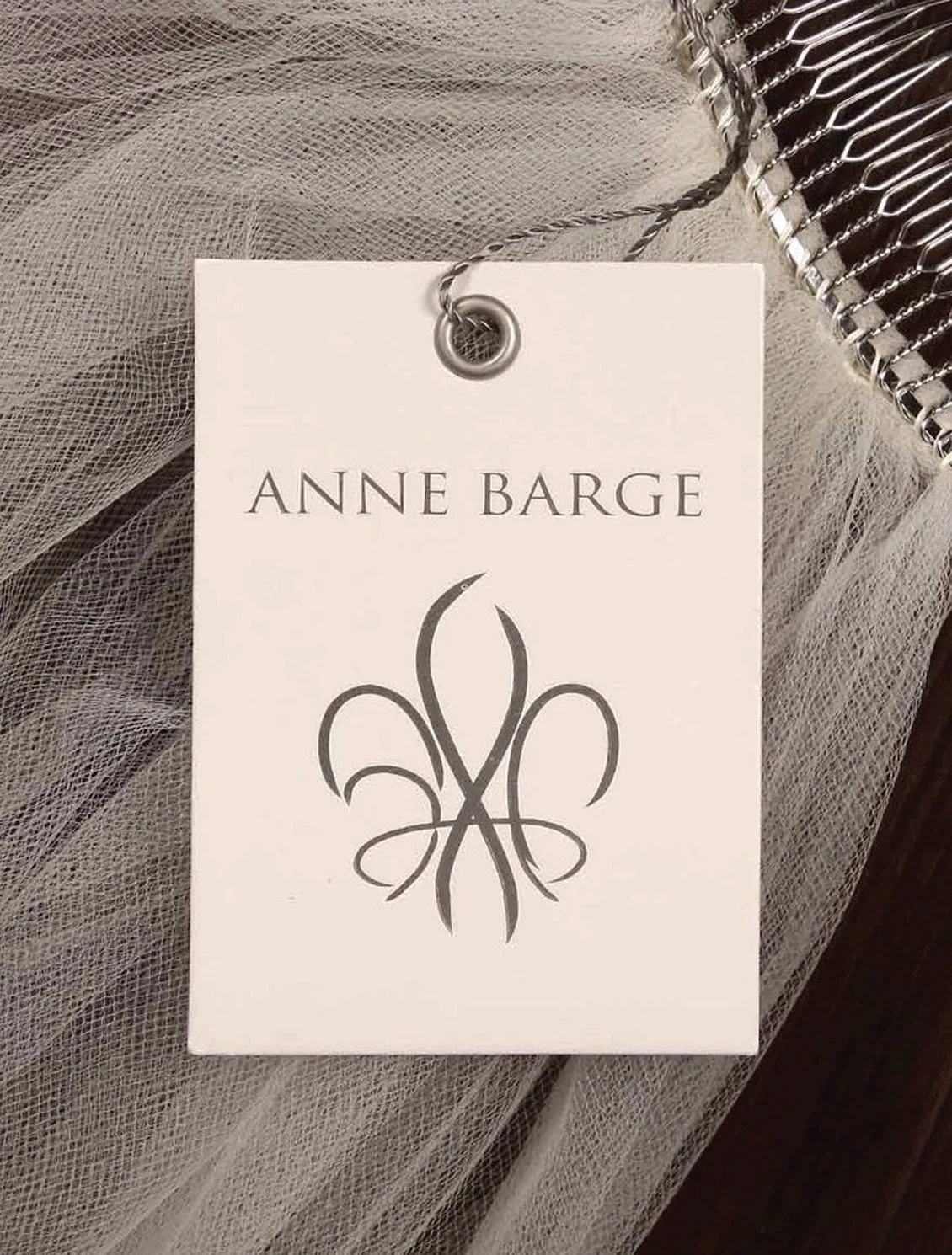
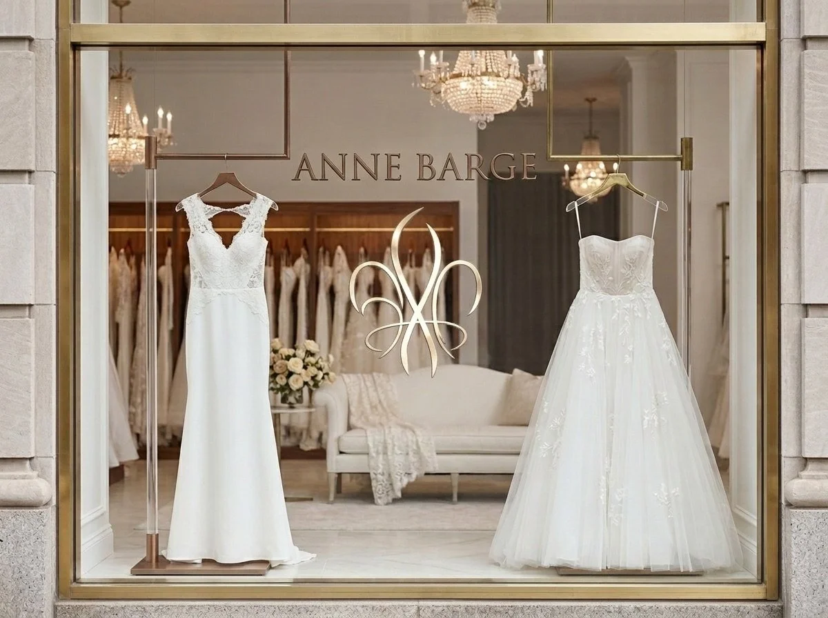
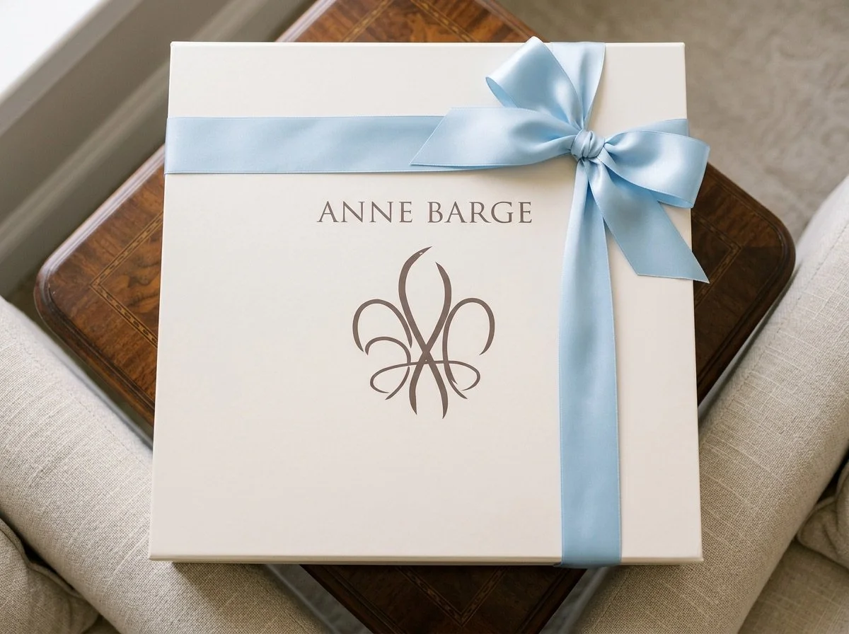
Client: Anne Barge
Category: Luxury / Designer Goods
When Anne Barge, one of the most preeminent bridal and special occasion design houses in the United States came calling for a fresh look, I designed a logo as timeless as the dresses themselves.
Simple lines (with clever initials flanking the classic, southern fleur-de-lis) scale beautifully across packaging, print, and retail, and this logo brings high-end, understated elegance.

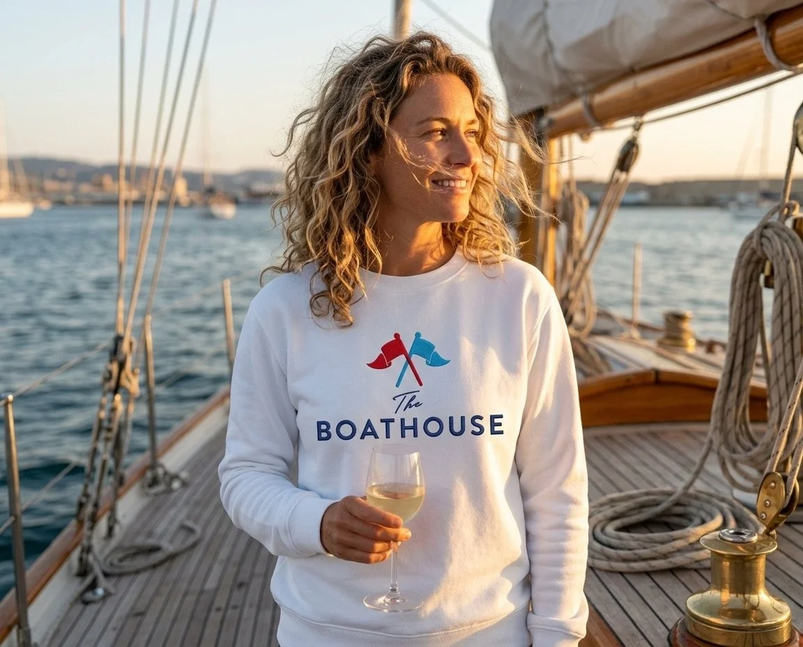
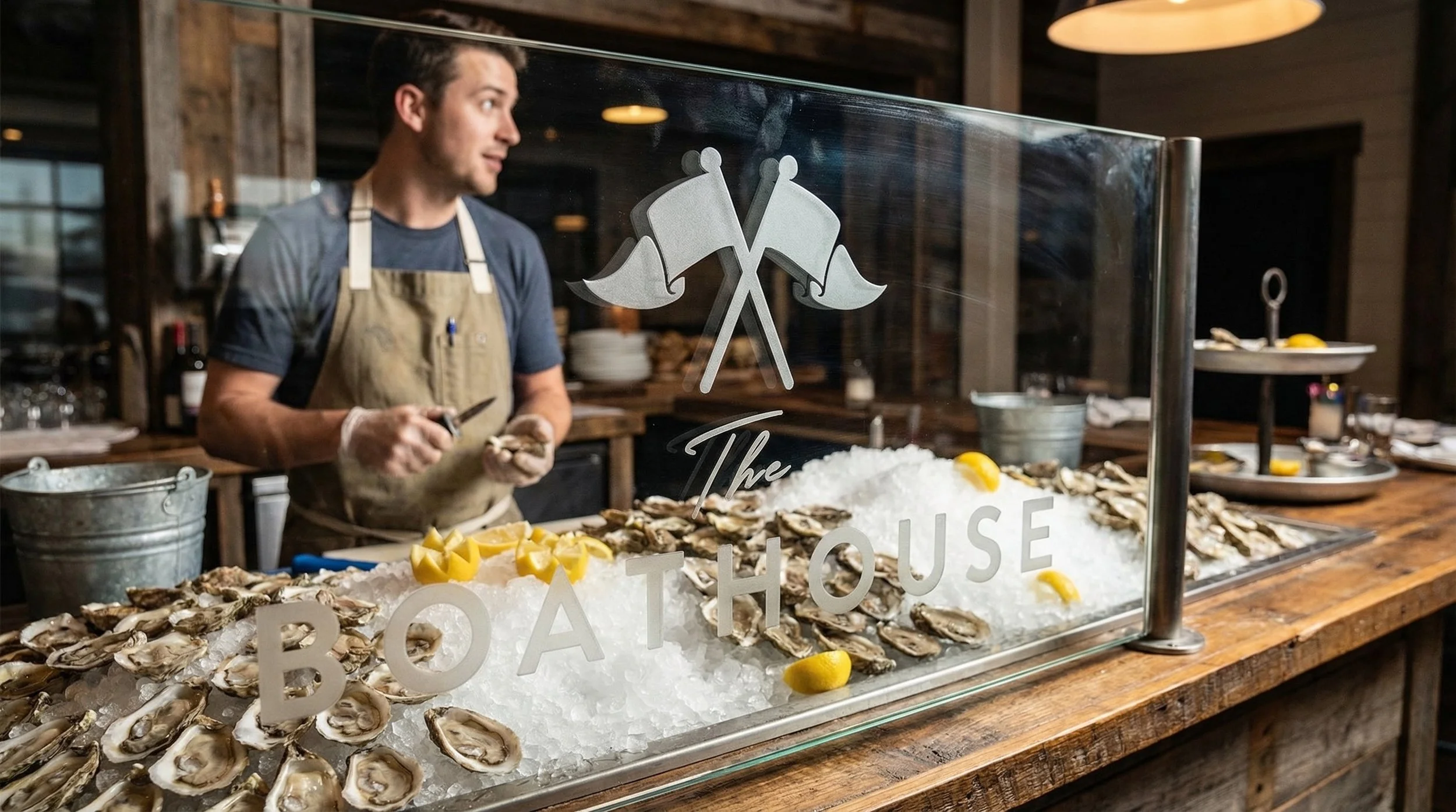
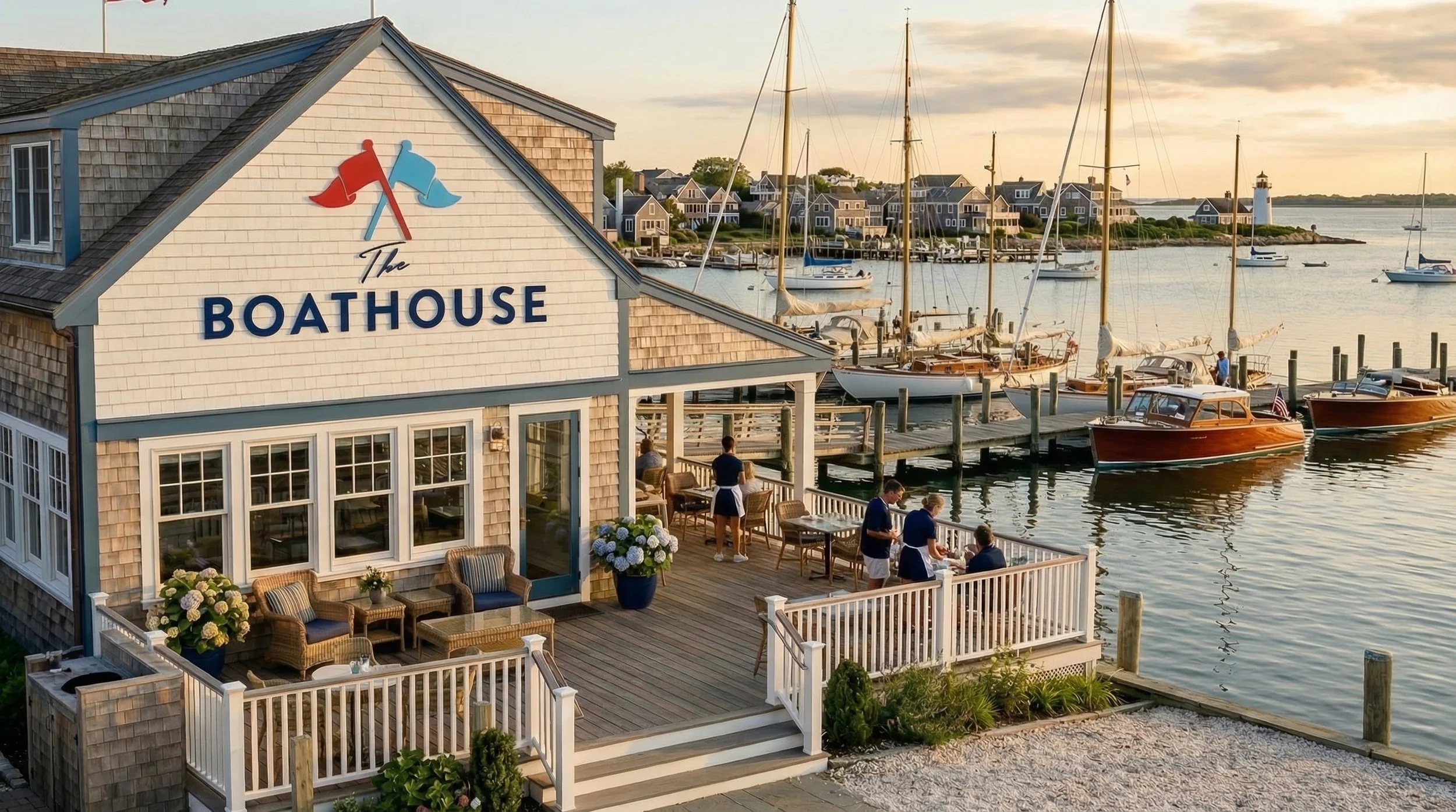
Client: The Boathouse
Category: Restaurant / Hospitality
Is there anything better than gathering with good people and good food – and while we’re at it – shall we throw in some golden hour sunsets?
The Boathouse brand identity channels coastal New England through classic maritime imagery while the clean, timeless typography invokes a well-appointed experience.
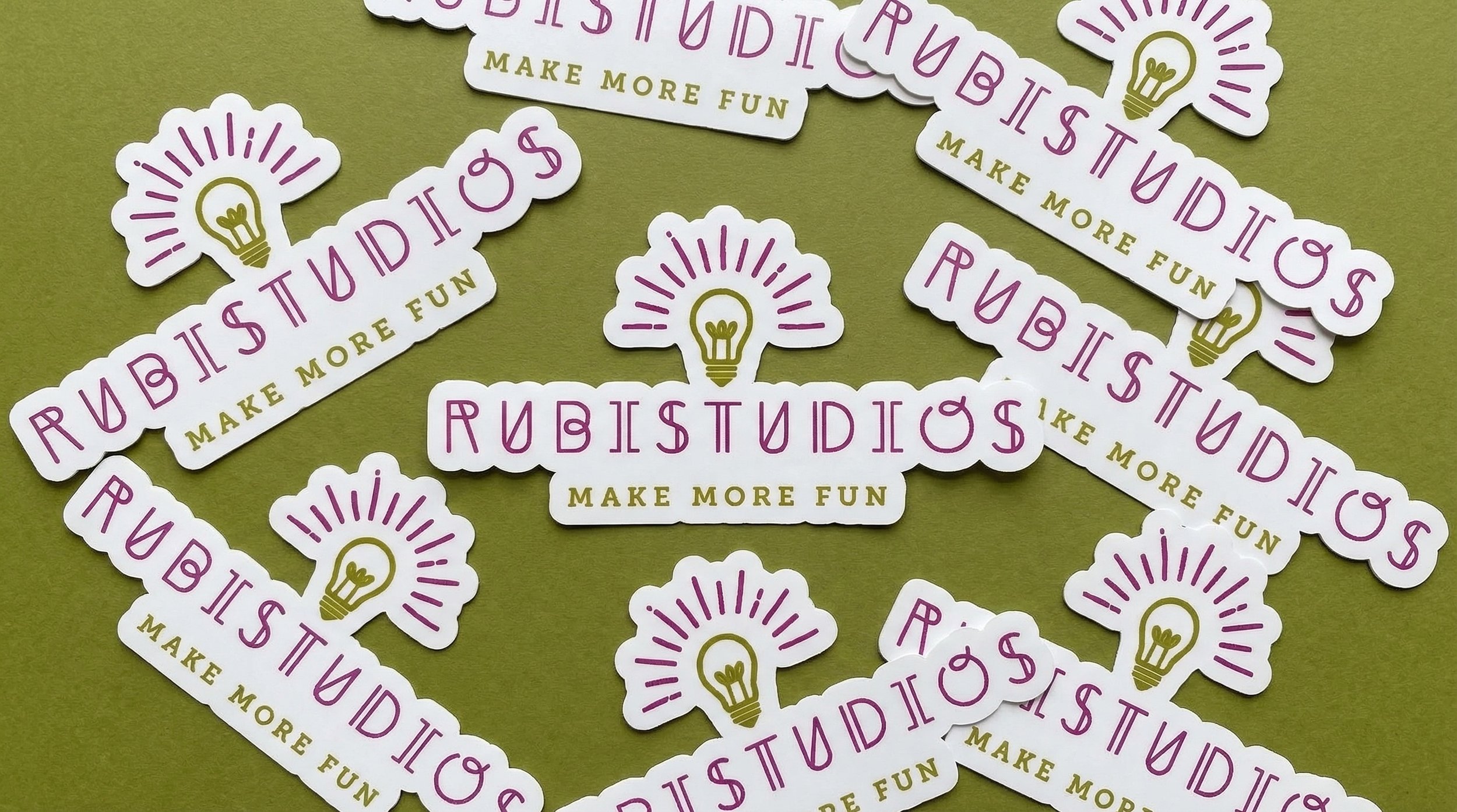
Client: RUBISTUDIOS
Category: Lifestyle
We turned the whimsy way up for this joyful creative studio. Artist Ruby McGrory of RUBISTUDIOS offers workshops that blend art, writing, cooking, and a host of other creative escapades.
The identity combines a saturated palette, playful typography, and energetic iconography that mirrors Ruby’s constant stream of high-voltage ideas.


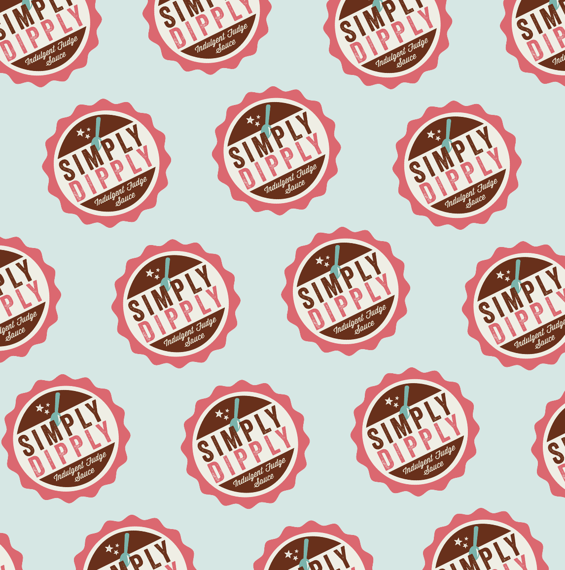
Client: Simply Dipply Indulgent Fudge Sauce
Category: Food & Beverage / Consumer Packaged Goods
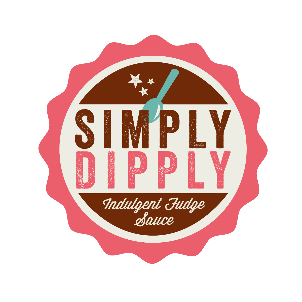
Simply Dipply serves up retro charm with a modern twist; the punchy packaging practically begs for a second look (and scoop).
The vintage-inspired yet modern logo feels one part old-fashioned sweet shop and one part high-end tasty treat. Clean, graphic type adds a bold punch, while the spoon and stars promise a delicious bite.


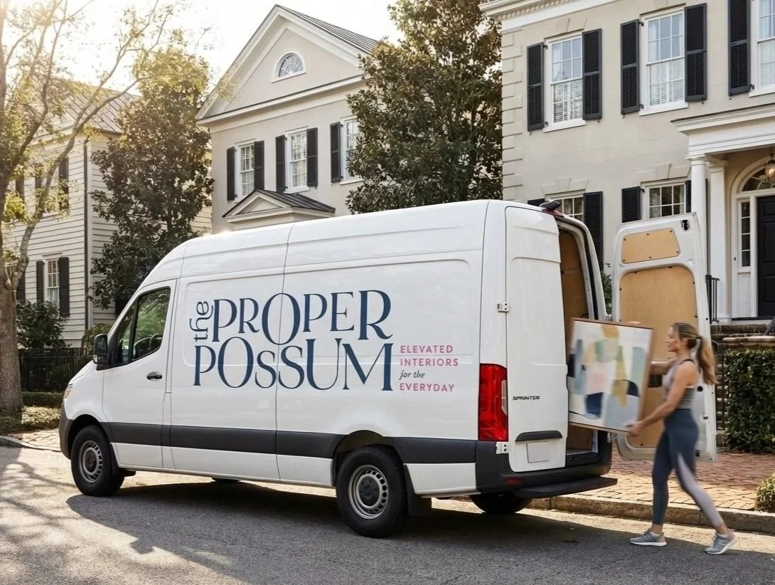
Client: The Proper Possum
Category: Lifestyle / Service
Wait. Is that a…possum? It sure is. A well-appointed, very proper one at that. Geared towards the budget-savvy homeowner, The Proper Possum’s girlfriend-with-a-good-eye ethos is grounded in attainable design solutions that delight.
The brand identity reflects the playful spirit of “high, low, anything goes,” always curating authentic spaces that feel uniquely like home.


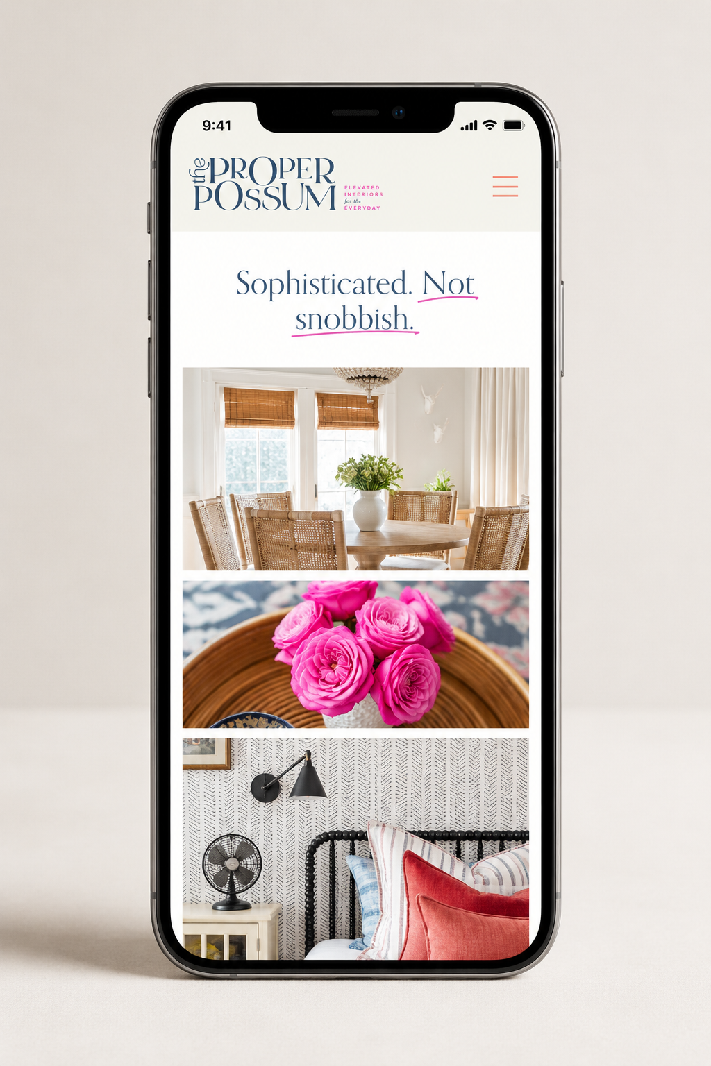
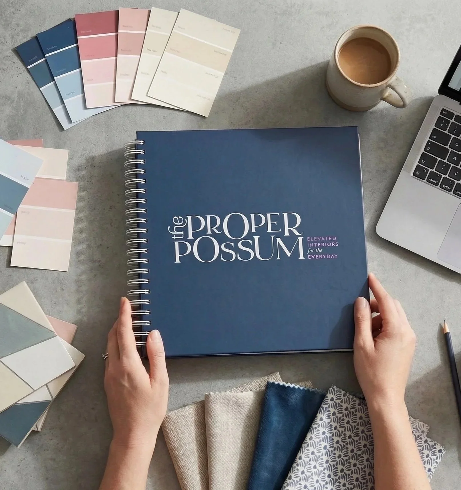
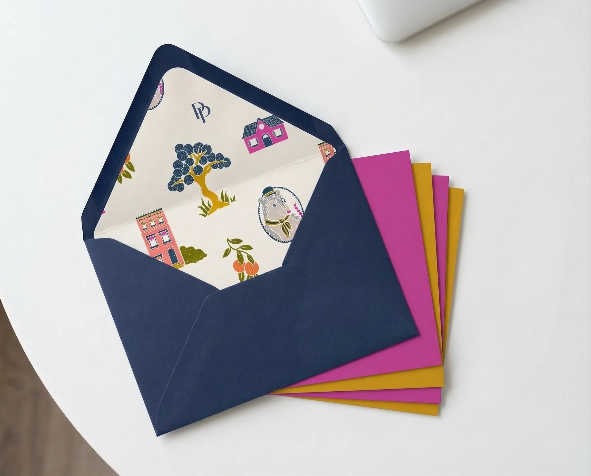
Character & pattern illustration:
Hollis Callas | Logotype: Jen Mageau
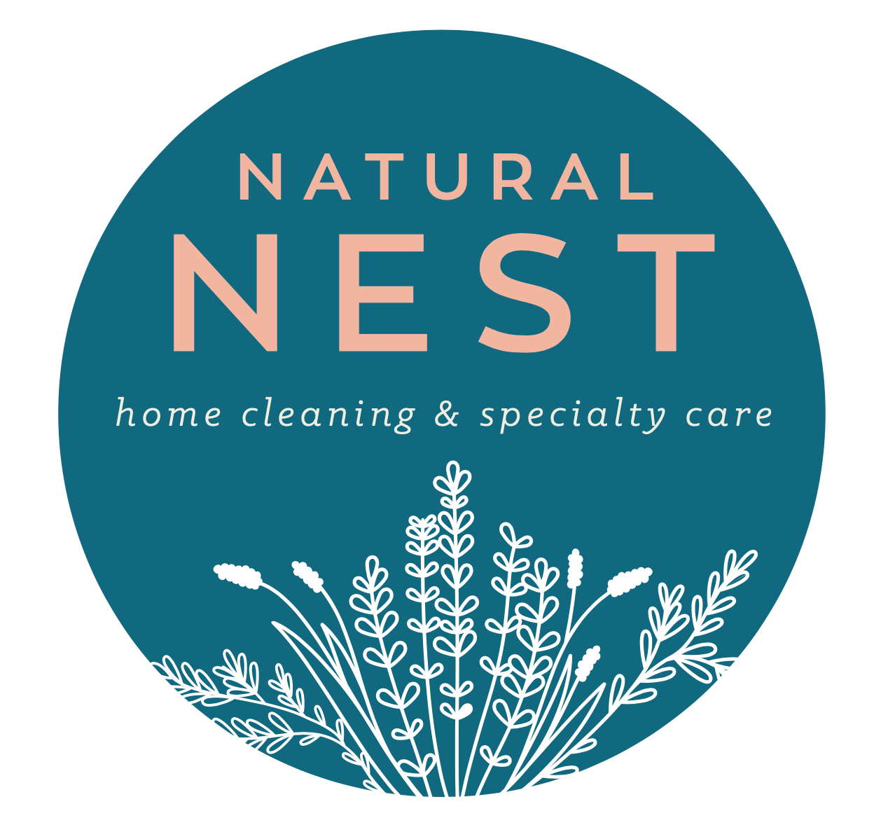
Client: Natural Nest
Category: Lifestyle / Service /
Consumer Packaged Goods
Natural Nest proves that hardworking cleaning services and products can still feel gentle, calming, and safe for everyday life. All Natural Nest cleaning methods and formulas are non-toxic, safe for family, pets and planet.
With this in mind, we created a brand identity that feels modern, soothing and inspired by Mother Earth herself.


Client: Southland Bread Co.
Category: Food & Beverage / Restaurant / Hospitality
Bring on the warm baguettes and salted French butter! Southland Bread Co.’s branding evokes a beloved local bakery that everyone wishes they had just around the corner.
Modern, yet slightly worn craft-inspired type, plus a wheat motif give a nod to the freshest, very best ingredients that bake the very best breads. The versatile badge lends itself to countless media usages.


Client: Goettee’s Barber and Shave
Category: Retail / Grooming & Personal Care
Located in Cumming, Georgia (a booming suburb of metro Atlanta), Goettee’s Barber and Shave is that idyllic hometown-feeling barber where folks “in the know” go for cuts and conversation.
A crisp black and cream palette paired with vintage-inspired typography gives the identity a timeless, welcoming feel rooted in old-school personal service.


Client: Grain & Steel
Category: Small Business / Artisan Trades
Skilled craftsman Jarod Roberts needed a brand identity that reflected both the sophistication and versatility of his work, spanning custom furniture, electrical, and lighting design.
By graphically combining a few tools of his trade with clean, elevated type, I created a logo that feels elegant, tactile and steeped in craft – just like Grain & Steel’s artisan work.


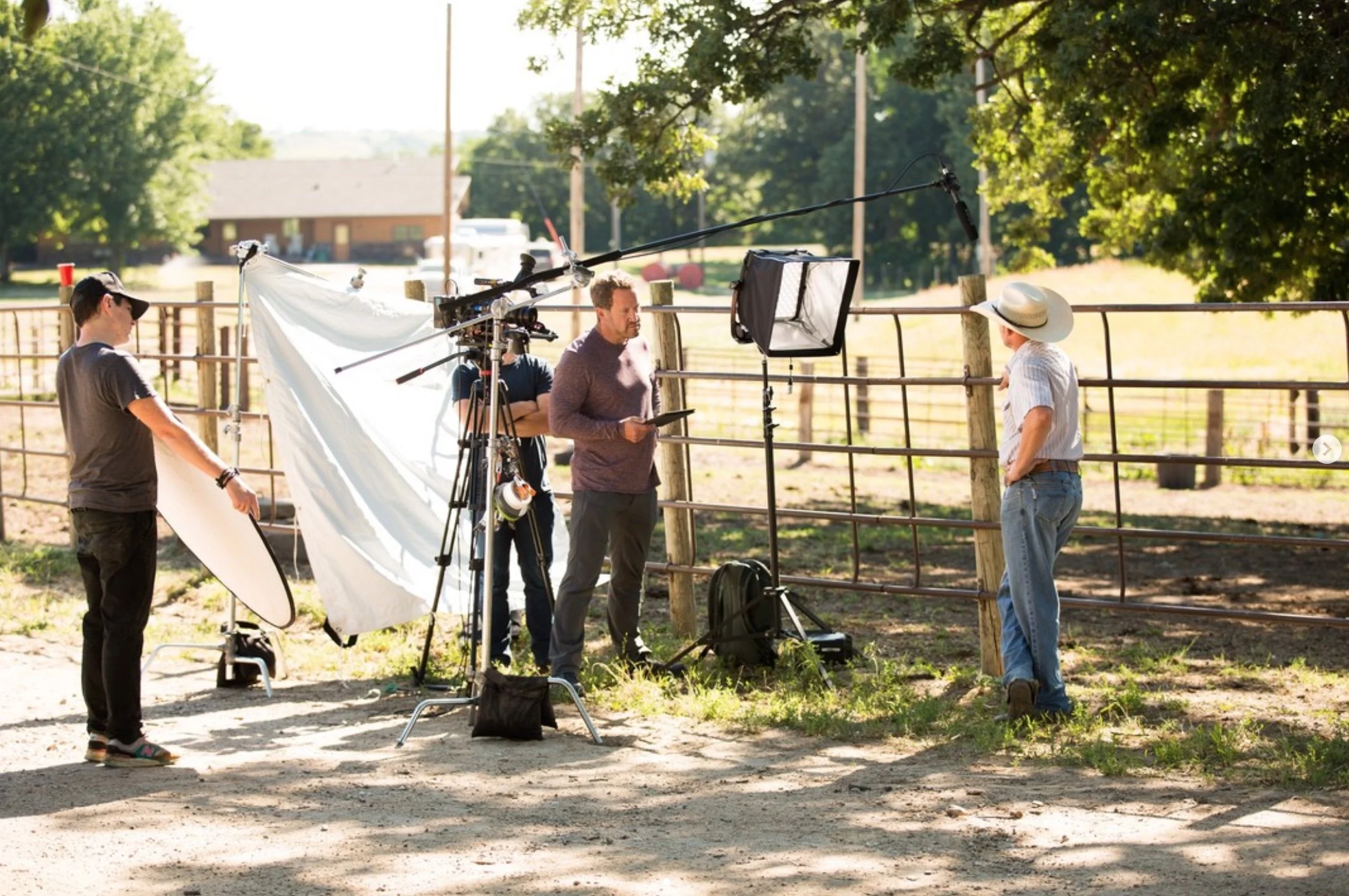
Client: humanstory
Category: Media Production & Film
When humanstory, a media and film production company based in Virginia, approached me for branding, it was critical that the design elements felt rooted in storytelling, and well, deeply human.
Lowercase typography and clean letterforms create a sense of warmth and approachability, while the flame — with a heart at its core — nods to the communal place where oftentimes the best stories are told.